Here are the different types of charts you can create within the Reports Dashboard.
Here are the different type of graphs and charts you can create within the Reports Dashboard:
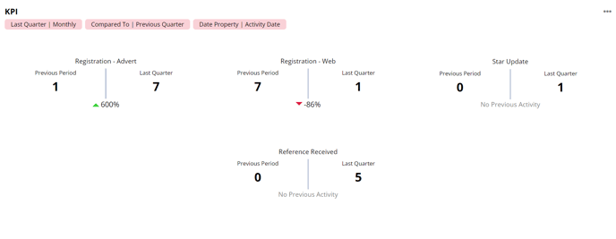
KPI Chart
The key performance indicator (KPI) chart will allow you to present data in a way where you can see immediately if your numbers have increased, decreased, or stayed the same during the selected time period.
The viewing for date on the dashboard determines the timeframe for the comparison.
For example, if the value is:
-
Today, the data will be compared to yesterday
-
This week, the data will be compared to last week
-
This month, the data will be compared to last month
Tables
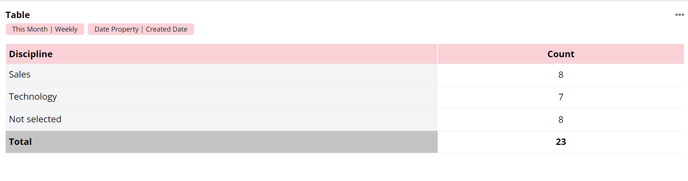
You can also present your data in a simple table format in the Reports Dashboard, which will show you the totals of the groupings you select for the time period you're looking at.
A table with just a Primary Display option will show all the groupings for that option, with a total for each of them based on the 'Measure By' option you have selected.
 A table with both Primary and Secondary Display options shows the Primary option in the column on the left, and the Secondary options in the next columns, and shows the total for each of these combinations as well as the overall total.
Clicking on any of the cells on the table allows you to view the data within that cell - so the example below would show all the data for Jobs in Sales with candidates at the Considering stage.
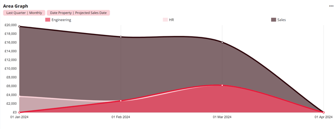
Line and Area Graphs
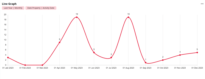
The line graph allows you to display your data over time when activity date is selected as the primary display. You can monitor the increase and decrease of your data with a single line view on the graph.
Your selected Primary Display option will be the X axis on the graph and the count will be the graph's Y axis.
When a Secondary Display option is selected you'll see multiple lines on your graph to represent these different values. This allows you to easily compare these to each other.
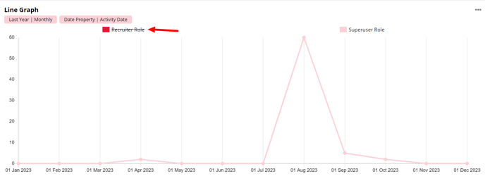
When there is multiple display options selected a chart legend will show. This is a key of what data is currently being presented.

Hovering over one of the points on the line graph will show a tooltip of the relevant display options. When there is one option selected the tooltip will be singular, however having multiple options selected will show a stacked tooltip.
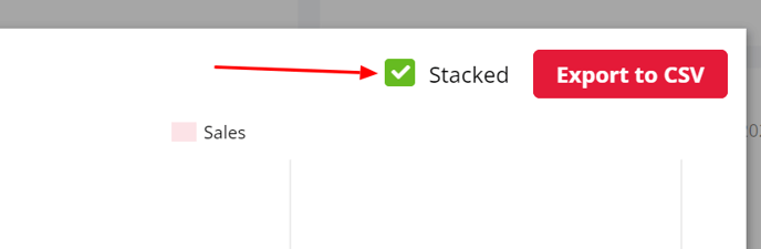
When creating a line graph that has both a primary and secondary display value selected, you can choose whether this is stacked or unstacked using the Stacked checkbox. A stacked line graph presents as an area graph.
You can click on individual values in the graph legend to remove these from the line graph view. To include the data back into the graph you can simply click on the value within the graph legend.
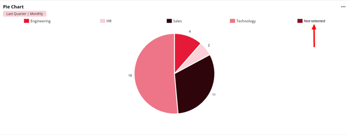
Pie and Donut Charts
Pie and Donut charts will display your data by converting percentages of data into segments of the chart. The arc length of each slice is proportional to the quantity it represents.
These charts are displayed alongside a chart legend, this is a key of what data is currently being presented.
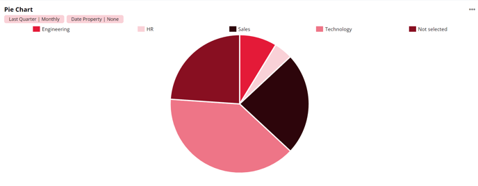
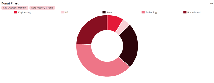
When you hover over a section of the chart the tooltip shows the primary display value that the segment is showing, and the % of the whole chart that the segment represents.
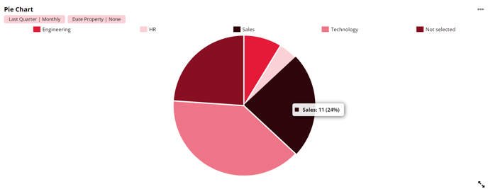
You can click on individual values in the chart legend to remove these from the chart view. To include the data back into the chart you can simply click on the value within the chart legend.
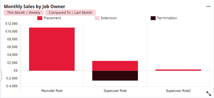
Bar and Column Charts
Bar charts will display your data in a standard horizontal bar graph. The data count will show along the X axis and your primary display will show along the Y axis.
Column charts are very similar to bar graphs with the only difference being your data count is displayed on the Y axis and your primary display on the X axis.
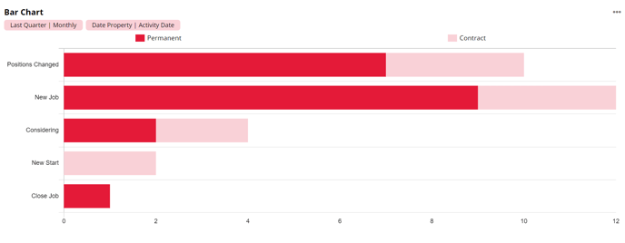
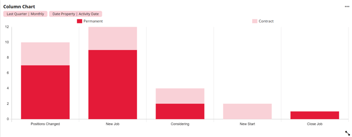
When creating a bar or column chart that has both a primary and secondary display value selected, you can choose whether this is stacked or unstacked using the Stacked checkbox.
When stacked is checked the data will show in one column or bar, split into different colours for each secondary display value. The hover over tooltip will also be stacked.
When stacked is unchecked the data will show in separate columns, split into different colours for each secondary display value. The hover over tooltip will also be unstacked, only showing information for the bar that you are currently hovered over.
When a bar or column chart has a primary and secondary display selected a key will also show, advising what secondary display value each bar is associated to. Hovering over each key item will also highlight the associated bar.
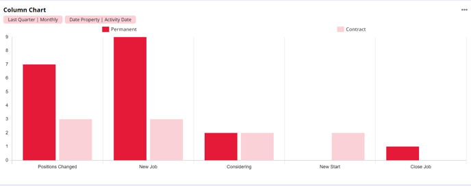
Selecting an item on the key will remove the associated bars from the graph, allowing further filtering to occur. To include these bars back into the graph you can simply select the item on the key again.
In cases where positive and negative values are shown, the positive values will show above the '0' line and the negative values will show underneath it.